Think back to a setup after which you sat staring at the chart. Everything lined up: the level was confirmed, the pattern looked textbook-perfect, the indicator was in the right zone. You entered — and the stop was triggered.
Not because your execution was wrong. Not because you missed a news release. But because the chart did not show the most important part.
Every level has a surface and an inner structure. A candlestick chart shows the surface: the touch, the bounce, the pattern. Order flow shows what is inside: who stood behind the level, with what volume, and how significant that participation was. Sometimes a clean surface hides a concrete wall. Sometimes it hides nothing at all.
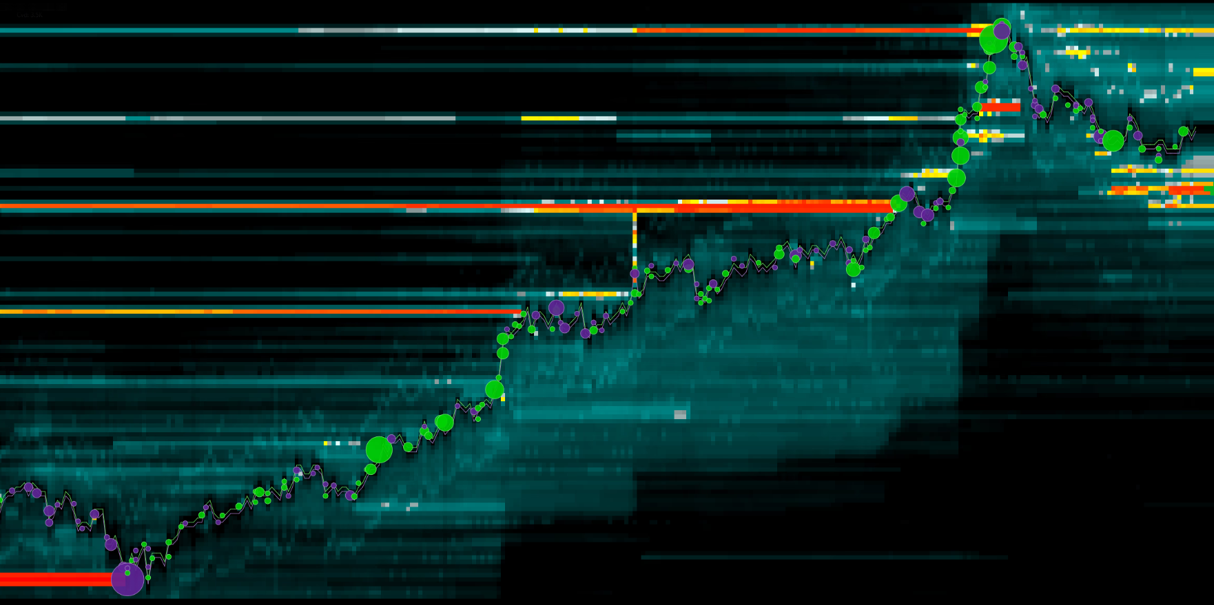
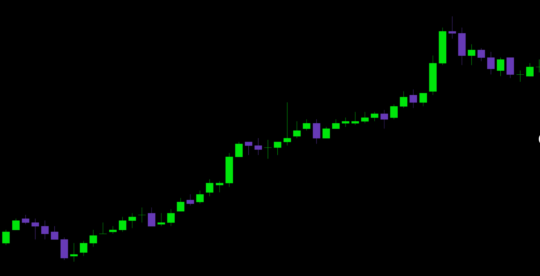
This module is about learning to tell the difference without discarding everything you already know.
The Third Dimension
Support and resistance levels work. Patterns work. Trends work. If they did not, no one would use them.
But here is the question: why do the same patterns sometimes work and sometimes fail? Why does a level that held three times collapse on the fourth attempt? Why does a perfectly formed setup turn into a trap?
Because technical analysis shows the structure: here is the level, here is the pattern, here is the channel. But it does not show what supports that structure. A level may be a concrete wall — tens of thousands of contracts in limit orders preventing the price from moving further. Or it may simply be a line drawn on the chart with nothing behind it. From the outside, both look the same.
The same applies to patterns. Head and shoulders, double bottom, flag — these are shapes. The same shape can be filled with volume, representing a real structure supported by actual activity, or it can be empty, representing a random outline formed by several candles. Technical analysis does not distinguish between them. A footprint does.


The same applies to trends. A trend may be initiative-driven, supported by real aggression, imbalances in every candle, and large trades in the tape. Or it may be driven by inertia: the impulse is fading, volume is declining, and cumulative delta is reversing. From the outside, both trends appear as a series of higher lows. Inside, they represent two different markets.
Technical analysis shows the structure. Order flow shows the content. Together, they provide the complete picture.
Volume analysis does not invalidate your experience. Levels, patterns, and the ability to read a chart all remain relevant. We simply add a third dimension: what stands behind what you already see. For now, this may still sound abstract, so let’s make it more concrete.
- Technical analysis shows the structure — levels, patterns, and trends — but not what supports it
- Identical shapes on a chart can hide completely different internal dynamics
- Order flow adds a third dimension: actual transaction data
- Volume analysis does not replace technical analysis; it complements it — your experience remains, while the analysis gains depth